B2B SaaS · Product analytics & digital product engagement
Apxor
Making a data-heavy engagement platform feel operable.
- Role
- Product Designer
- Team
- Cross-functional — product, design, engineering
- Duration
- Feb 2021 – Apr 2023 · 2 yrs 3 mos
- Status
- Live product
Situation
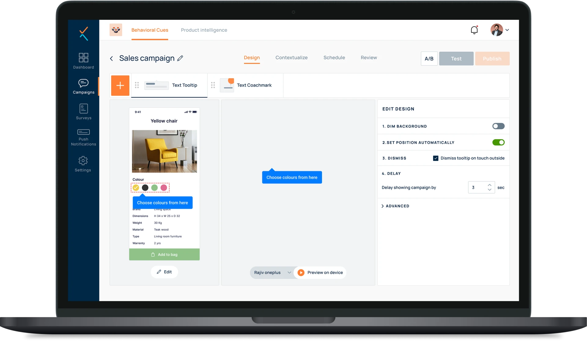
Apxor is a B2B SaaS product analytics and digital product engagement platform. As its capabilities expanded, users had to work across behavioural data, segmentation, analytics and in-app engagement in a single sitting — and still walk away with a decision.
The problem
Powerful analytics and engagement capabilities lose their value when teams cannot understand or operate them confidently.
Complex workflows needed to become easier to discover, configure, interpret and act on without reducing what the platform could do. Capability without comprehension does not convert into product outcomes.
Users & context
- Who
- Product managers, growth teams, marketers, analysts and developers responsible for understanding product usage and improving engagement.
- Where
- Professional workplace settings — SaaS companies and product teams, working individually and collaboratively.
- Device
- Primarily desktop and laptop, through Apxor's web platform.
- Comfort level
- Moderate to high. Comfortable with dashboards and analytics, but still need complex workflows to be efficient and understandable.
My role & constraints
Product Designer
- An evolving platform — patterns had to scale with new capabilities rather than be redesigned each time.
- Advanced functionality could not be simplified away; depth had to stay reachable.
- Technical feasibility and delivery timelines were shaped alongside product and engineering.
The journey
- 01Understand product behaviour
- 02Identify a relevant segment
- 03Create an engagement
- 04Configure targeting & triggers
- 05Launch
- 06Monitor performance
- 07Optimise
Where it broke down
- Dense analytics screens with large amounts of information competing for attention.
- Configuration points where it was unclear what a setting did or which condition to choose.
- Multiple targeting conditions interacting in ways that were hard to predict before launch.
- A gap between reading an insight and taking the action it implied.
Design approach
- 01Mapped product requirements, user goals, technical constraints and existing workflows with product and engineering.
- 02Used product analytics and behavioural insight to locate friction and opportunity across the journey.
- 03Designed information architecture and flows for complex capabilities before touching UI.
- 04Explored interactions through wireframes and prototypes.
- 05Designed data-heavy interfaces around hierarchy, discoverability and lower cognitive load.
- 06Contributed reusable patterns and design-system consistency across the platform.
- 07Reviewed feedback and product behaviour, iterating as requirements evolved.
Information architecture
Organised around the major product activities — analytics, audiences and segments, engagement creation, configuration, campaigns and performance — so users could move between understanding behaviour and acting on it without leaving their train of thought.
Key decisions
Separate primary information from secondary detail
Clear visual hierarchy on dense screens let users read the state of things first, and drill into supporting detail only when they needed it.
Explain settings in place
Concise labels and contextual copy clarified what a configuration choice would do, reducing the fear of setting something up wrongly.
Group related controls
Structured configuration layouts kept connected decisions together, so a targeting rule read as one thought rather than scattered inputs.
Make behaviour predictable
Consistent components, states, previews and interaction patterns meant the product behaved the way users expected across capabilities.
The final experience
The interface aims for clarity, control and confidence: a sophisticated product that feels powerful without feeling complicated, and closes the loop between behavioural data, insight, engagement and performance.
Evidence
The numbers below are metrics Apxor publishes about the product and its customers. They describe platform and business outcomes across many teams — they are not measurements of my individual design contribution, and no causal claim is made here.
- 20M
- users nudged per day
- Published by Apxor
- 25%
- average increase in conversions
- Published by Apxor
- 15 min
- to launch a nudge, without code
- Published by Apxor
- 80%+
- completion on in-app contextual surveys
- Published by Apxor
“Simplifying user onboarding and feature adoption.”
What I learned
- Simplification in B2B is rarely removal — it is sequencing, naming and grouping.
- Behavioural data is a design input, not just a reporting output.
- Patterns you can reuse are worth more than screens you can polish.
Next case study
FreeBird