Fintech · Lender-side repayment tracking & collection
FreeBird
“Who do I need to follow up with today?”
- Role
- Solo UX/UI Designer
- Team
- Solo design ownership
- Duration
- ≈2 years · part time
- Status
- Live on App Store & Google Play
Situation
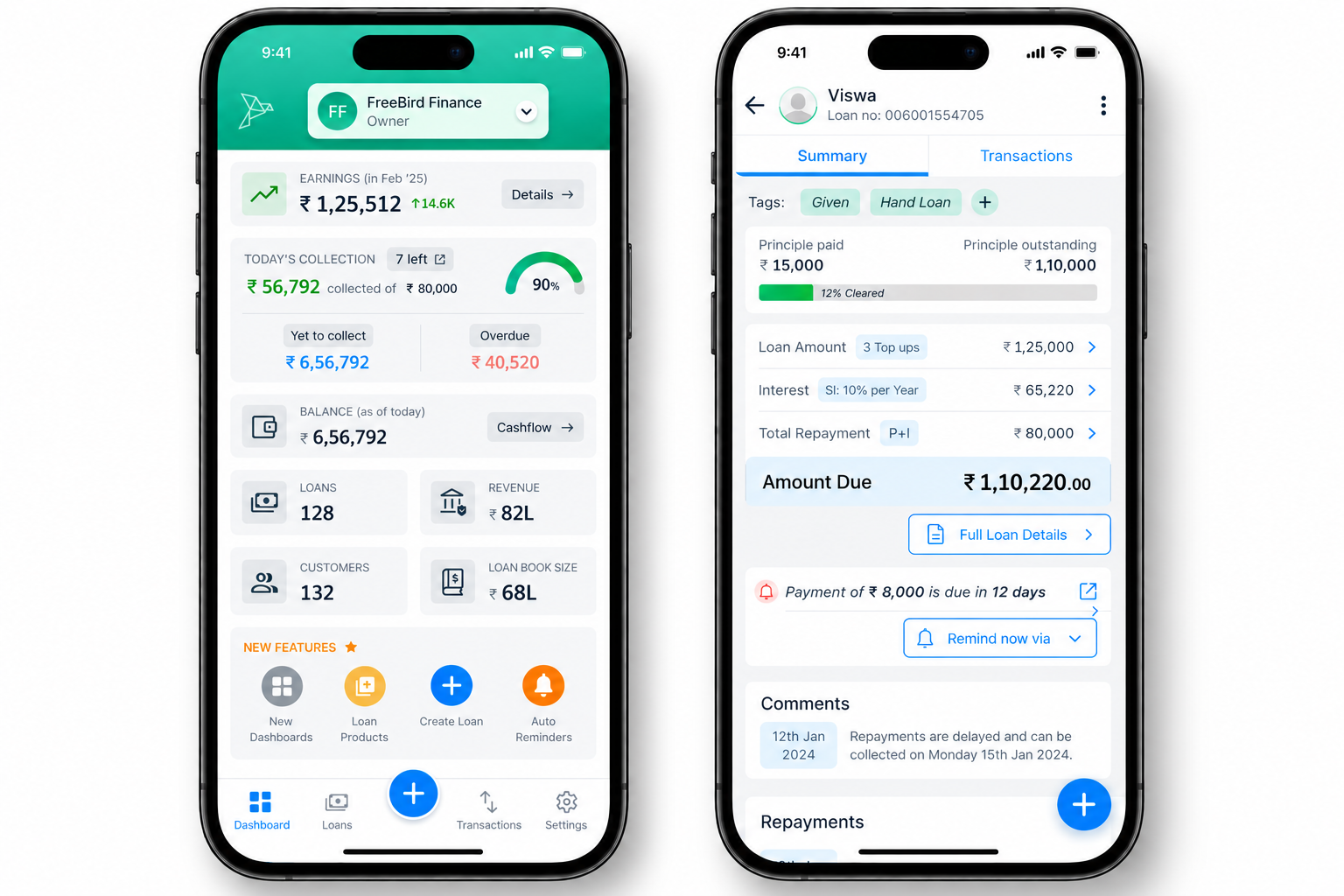
Lenders were managing repayments through manual records, personal reminders, calls and messages. As the number of borrowers grew, tracking who owed money, how much, when, and who needed a follow-up became difficult — and missed follow-ups made collection harder.
The problem
Lending the money is the easy half. Afterwards the lender has to remember who owes what, when it is due, what is still outstanding and who has already been reminded.
Collecting money back on time is the bigger challenge than lending it. Missed dates, inconsistent follow-ups and poor visibility into outstanding amounts turn a simple arrangement into ongoing effort.
Users & context
- Who
- Lenders tracking money lent to multiple borrowers and managing repayment collection. Borrowers are affected indirectly, through reminders and repayment communication.
- Where
- Mobile-first, managed in the gaps of everyday work and personal responsibilities.
- Device
- Primarily smartphones — Android and iOS.
- Comfort level
- Basic to moderate. Had to stay simple for people used to common mobile apps, with no financial-software expertise assumed.
My role & constraints
Solo UX/UI Designer
- Solo designer — problem understanding through production UI.
- Money is involved: amounts, dates and statuses had to be unambiguous.
- Mobile-only surface, iterated against development constraints over roughly two years.
The journey
- 01Record money lent
- 02Define repayment details
- 03Monitor upcoming repayments
- 04Identify due / overdue
- 05Remind the borrower
- 06Record collection
- 07Track what remains outstanding
Where it broke down
- Remembering multiple repayment dates across borrowers.
- Manually checking who currently owes money.
- Keeping track of partial and outstanding repayments.
- Repeatedly following up — without knowing whether a reminder already went out.
Design approach
- 01Mapped the lender's end-to-end repayment journey, from recording a loan to closing it out.
- 02Organised information architecture around loans and repayment status rather than around app features.
- 03Designed flows for loan tracking, repayment schedules, due and overdue states, reminders and follow-ups.
- 04Explored solutions through wireframes, then built reusable UI patterns and components.
- 05Developed interactive prototypes and iterated on requirements, usability considerations, feedback and development constraints.
Information architecture
Structured to the lender's mental model: loans and borrowers → repayment schedule → repayment status → reminders and follow-ups → repayment history.
Key decisions
Status is the primary signal
Upcoming, due, paid and overdue are visually distinct, so the state of a repayment is readable before any number is parsed.
Amounts, dates, next action — in that order
Hierarchy inside each item answers what is owed, by when, and what to do about it, so scanning replaces searching.
Plain language over financial vocabulary
Simple wording keeps the product usable for lenders who are not finance professionals.
Answer one question on open
The experience is arranged so opening the app answers a recurring question: who do I need to follow up with today?
The final experience
A single mobile workflow that replaces memory, notes, calls and separate reminders — designed to create control, reassurance and clarity, with visible repayment states that show what needs attention.
Evidence
These are product-level figures published by FreeBird. They show real-world usage of a shipped product; they are not a measurement of design impact in isolation.
- 100K+
- Google Play downloads
- Published by FreeBird
- 6,500+
- loans added in the last 30 days
- Published by FreeBird
- 66K+
- payments logged in the last 30 days
- Published by FreeBird
- 4.6
- App Store rating
- Published by FreeBird
“Significantly simplified my lending operations.”
Still to be validated: reduction in missed follow-ups, repayment collection improvement, reminder-to-payment conversion, and time saved versus spreadsheets and manual follow-ups.
What I learned
- In money products, ambiguity is the bug — clarity of state is the feature.
- Designing for a recurring question is sharper than designing for a feature list.
- Owning a product end-to-end teaches you which decisions survive implementation.
Next case study
Doctor Branding & Appointment Booking