Healthcare · Doctor discovery, trust & appointment booking
Doctor Branding & Appointment Booking
From “is this the right doctor for me?” to a booked appointment.
- Role
- UX & UI Designer
- Team
- Teamed with a developer for deployment
- Duration
- 2 months
- Status
- Live and running
Situation
The doctor needed a digital presence where prospective patients could understand her expertise, services and credentials — and still have a straightforward way to move toward an appointment.
The problem
Choosing a doctor is a trust-sensitive decision. A digital presence has to answer relevance and credibility before it asks for a booking.
Patients need to quickly judge whether a doctor is relevant to their condition and trustworthy enough to consult. An unclear, overly promotional or poorly structured presence makes people hesitate even when the doctor is highly qualified.
Users & context
- Who
- Prospective and existing patients looking for information about the doctor, services and appointment availability.
- Where
- Searching from home, work or on the move — usually before deciding whether to visit or call the clinic.
- Device
- Primarily smartphones, with responsive support for tablet and desktop.
- Comfort level
- Varied — from patients who book services online routinely to those who mainly browse, call and message. Simplicity mattered most.
My role & constraints
UX & UI Designer
- Two-month timeline, with a developer handling deployment.
- Healthcare communication had to stay credible and non-promotional.
- Content had to be readable across a broad patient population and a wide range of devices.
The journey
- 01Discover the doctor
- 02Understand expertise
- 03Evaluate relevance
- 04Build trust
- 05Explore services
- 06Book or contact
Where it broke down
- Healthcare information is often hard to scan.
- Patients may not be able to tell whether a doctor treats their specific condition.
- Appointment information sits apart from the information that supports the decision.
- The critical drop-off is between discovering the doctor and deciding to book.
Design approach
- 01Studied the practice, patient needs, services, and the information patients need before booking.
- 02Structured information architecture around common patient questions and decision points.
- 03Defined the journey from discovery → expertise → trust → appointment.
- 04Created wireframes to establish content hierarchy and key interactions.
- 05Designed the visual identity and UI for credibility, clarity, readability and healthcare-appropriate tone.
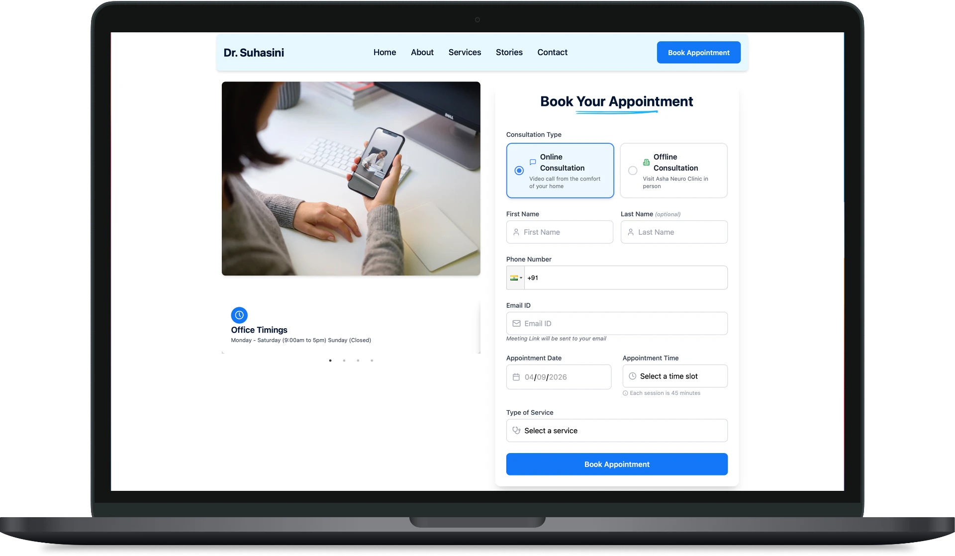
- 06Designed responsive screens and appointment-booking touchpoints, with reusable UI patterns for consistency.
- 07Reviewed and iterated through implementation with the developer.
Information architecture
Ordered by patient decision-making: doctor introduction → expertise → services and conditions → credibility → patient information → appointment and contact.
Key decisions
Answer relevance before asking for action
Expertise and conditions treated come early, so a patient can self-qualify before the booking ask appears.
Credibility signals, not claims
Credentials and services are presented plainly. Nothing is overstated — in healthcare, restraint reads as trust.
Patient-friendly language
Copy avoids clinical density so a wide patient population can read it quickly on a phone.
One obvious next step
Prominent, repeated appointment actions mean the next move is never something a patient has to look for.
The final experience
A calm, professional healthcare presence with generous spacing and clear hierarchy — credible without being cold — that carries a patient from uncertainty toward confidence in booking.
Evidence
No research, usability or outcome metrics were recorded for this project. Rather than estimate numbers, this case study is presented on the strength of its decisions.
Still to be measured: appointment enquiry rate, mobile completion of the booking step, and which content patients read before contacting.
What I learned
- Trust is an information-architecture problem before it is a visual one.
- A decision funnel is a more honest frame here than a habit loop.
- Restraint in healthcare communication does more for confidence than persuasion does.
Next case study
Apxor